KUOW app
What is it?
KUOW is a thriving local NPR radio station. Who rebranded to appeal to a younger demographic right before this project began
Problem statement
KUOW’s app was aging out of relevance. They needed to improve the functionality and embrace modern listening habits.
My role
Sketching
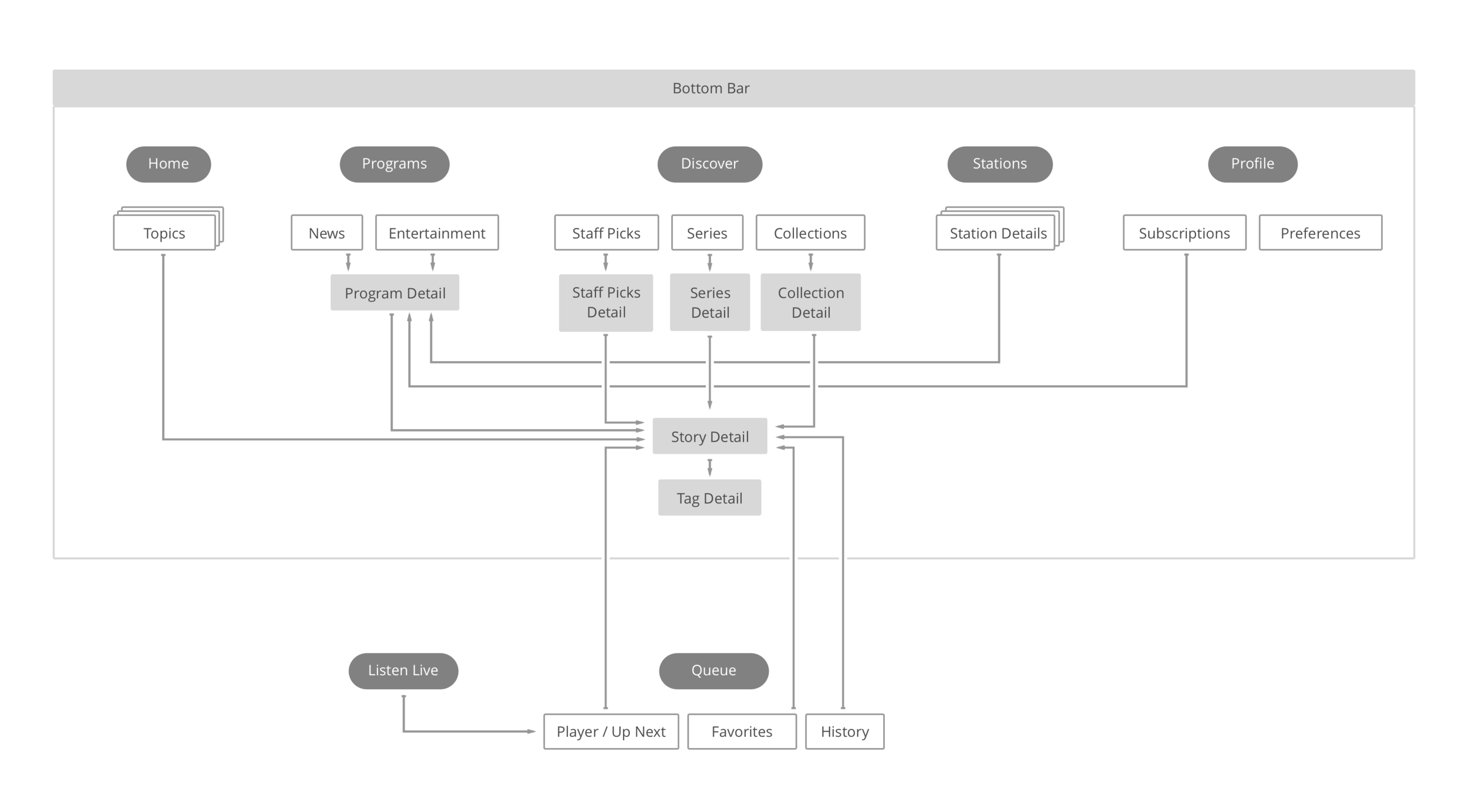
Information architecture
User flows
Wireframing
User Interface design (UI)
Asset export
Design QA
Important contributors
Chris D’Annunzio: iOS Developer
Tara Ward: Project Manager
Project Goals
Increase user engagement
Increase sustaining members
Create a sense of place
Focus on streaming content
KUOW app v1
A quick heuristic analysis
Stories auto-play on all articles
If you were already listening to a story and opened an article, the new story interrupts your audio. Even worse, it played regardless of mute settings!
Social media functionality was ineffective
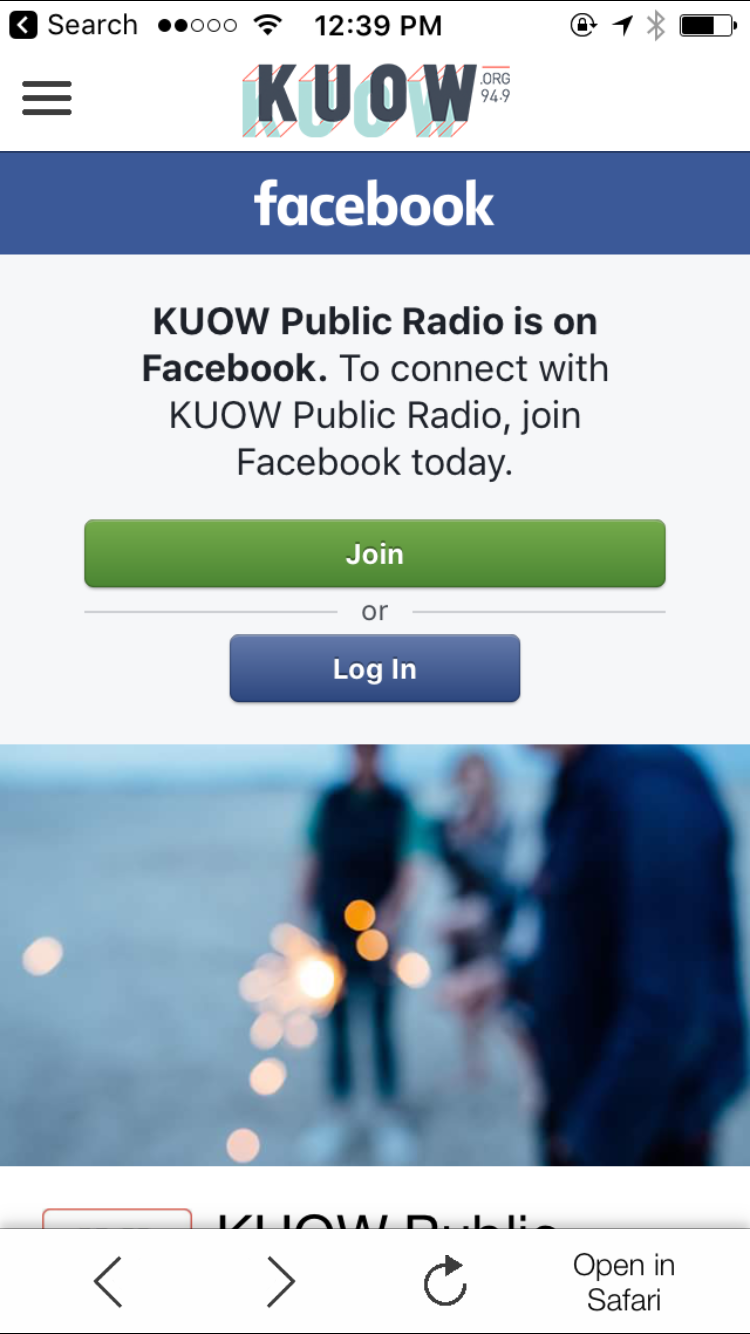
The social media integrations were just web views of KUOW’s pages.
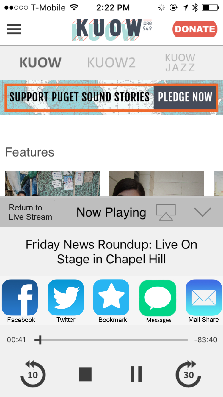
The audio controls didn’t allow for continuous streaming
The share functionality completely overwhelmed the main audio controls.
Persona research
KUOW had recently been through a rebrand to appeal to a younger demographic. I was able to use their rebrand persona, Alisha as a starting point. Then I added a persona for their established listeners based on existing research.
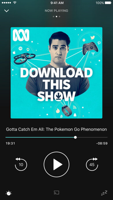
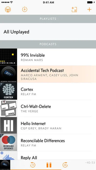
Inspired by Alisha’s listening habits, I did an audit of several popular podcasting and radio apps. This helped determine how to appeal to a younger audience.
Competitive Analysis
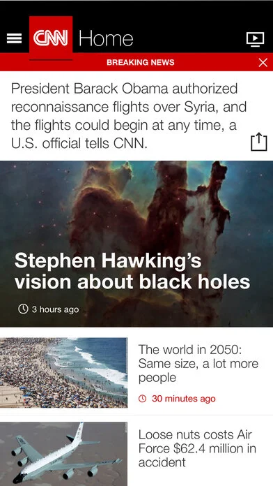
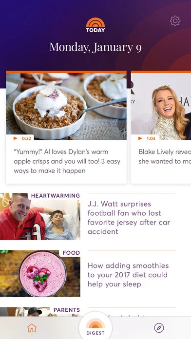
This app lived in two worlds: Audio and News. I wanted to gather references, inspiration and an understanding of both these categories.
Audio
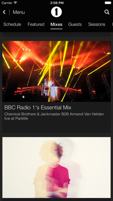
BBC Radio
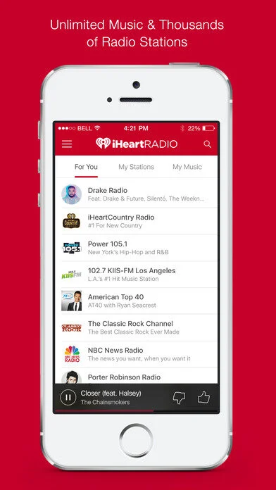
iHeartRadio
Pocket Casts
Overcast Podcasts
News
Apple News
CNN News
Today News
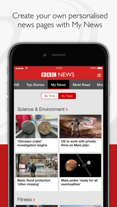
BBC News

Navigation Pattern Exploration
Catering to both personas
After exploring several navigation patterns, I returned to my second user persona: Joe. I settled on a top and bottom tab bar system. This provides a strong information scent to encourage Joe to explore the app. It also is a familiar pattern to both iOS and Android users.
I elevated familiar content and grouped the less intuitive content in a discover tab. For the home screen, I made use of a traditional news feed. Throughout the app, access to the queue is only a single tap away.
Adapting to all stories
A huge consideration for the app was adapting the design to the range of stories that KUOW produces. They cover gut-wrenching stories to light humorous articles. Jon White provided the lovely typography choices of More for headlines and PT Serif for body. From this starting point, I chose a black condensed face for headlines. This weight is both space efficient and capable of handling any content.
Ease in consistency
As I moved into wireframes I wanted to dial in the queue and listening experiences. I added swipe gestures for the Aspirational Listener and a more menu for the Dedicated Donor. This allows listeners to add, remove, favorite and share stories. My goal was consistency across all screens of the app.
Navigation
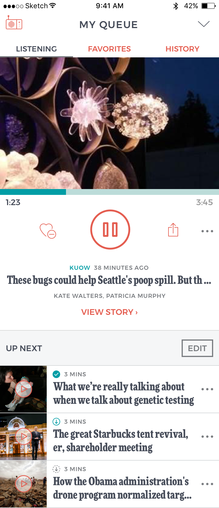
The queue is accessible from many points; the mini player, and both sides of the top section level headers.
The queue icon (right) is always present throughout the app. The live broadcast shortcut (left) appears at all top level screens.
Home screen
I based the home screen visuals on popular news apps to reinforce the fresh content.
Queue
The queue is a combination of the player controls and the up next list of stories. All swipe gestures work here, and bulk editing of the list is quick and easy.
Visual design
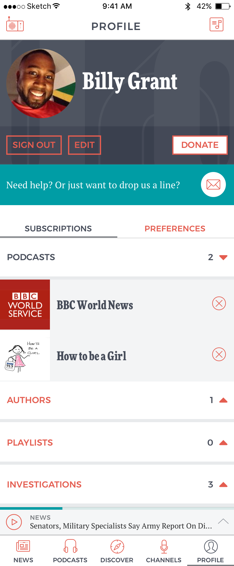
This was the second application of the rebrand. For the first, check out my donation form case study. I applied the same clean, modern approach while adapting it to mobile app conventions.






What I learned
Number 1
TEST
This app was also not tested with users before release. The app was not as stable as it should have been. In the future I would do a limited release and test with users before releasing to everyone.
Number 2
Tablet designs
I wish I had spent more time on the tablet designs. Tablet ended up being the phone version stretched horizontally. Moving forward, I prefer to create designs for phone and tablet at the same time.
Conclusion
This project is the best example of my UX and UI design skills. I am proud of the design consistency and polish.
It was also a pleasure to work with the folks from KUOW. I had great meetings with the client to present and receive feedback on the work. Thanks to my amazing Project Manager Tara Ward, it was one of the smoothest projects we’ve ever run. We hit our deadlines with zero scramble. This project cultivated a great relationship with the client. Moby redesigned their main website after the completion of this project.
⭐⭐⭐⭐⭐
Reviews from the App Store
“My morning go-to”
“Love the graphics re-design. This app is reliable and makes taking a quick moment to listen in the morning easy.”
— User Mjmomma
“Very effective app”
“The NPR app is minimal, effective and engaging. The treasure trove of old episodes oof programs like Wait Wait and others which I cannot listen to live, has helped me through innumerable times.”
— User Jeaniepeter
“Home away from home”
“I love being able to listen too my home station when I am on the road. I also appreciate the ability to listen to the additional streams.”
— User Tuckertoytosser
“I love this app”
“I have been using a version of this app since it first came out, and before then, on the computer. This lets me take my local Seattle news on the road with me which I travel. No problems with the app - it's great!”
— User MamaInSeattle
Want to chat?
kaitlinpowelldesign@gmail.com
(253) 254-6679
